
"Where is Berta?"
Ben & Jerry's Pop Up Store
Pop Up Store concept for the Ben & Jerry's brand, to launch the new vegan ice creams. Storytelling deals with the disappearance of the cow Berta. The cow is the icon of the brand and stands among other things for milk ice cream enjoyment. However, the vegan varieties are based on almond milk, which is why the cow is out of place here. "Where's Berta?" is the appeal. As part of a short film shown in the Pop Up Store, her disappearance becomes clear: she takes a holiday in Mallorca, where the almonds are grown on plantations. The vegan ice-cream makes it possible for Berta to relax a little bit from her everyday life on the pasture.


The vegan ice cream varieties are based on four existing ice cream varieties. The consumer should therefore notice no / little difference. The packaging is also different only at second glance. Convincing a vegan of the ice cream varieties shouldn't be difficult. From my own experience I am grateful for every veganized product. To convince a non-vegan person of the taste is already clearly more difficult, particularly if he knows that the product is vegan. That is why this is a guerrilla concept. The Pop-Up-Store lures with free tasting without pointing out the new products. Only the short film "Where is Berta?" reveals the vegan origin. By then, however, the ice has already been eaten and the true first impression can no longer be tarnished.
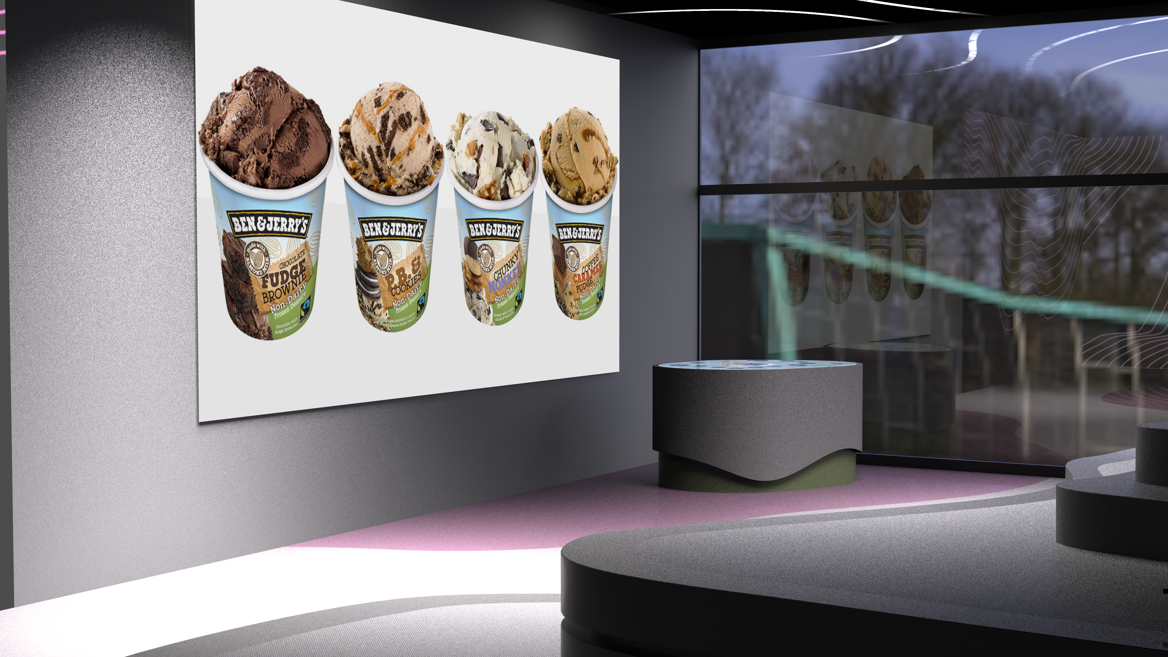

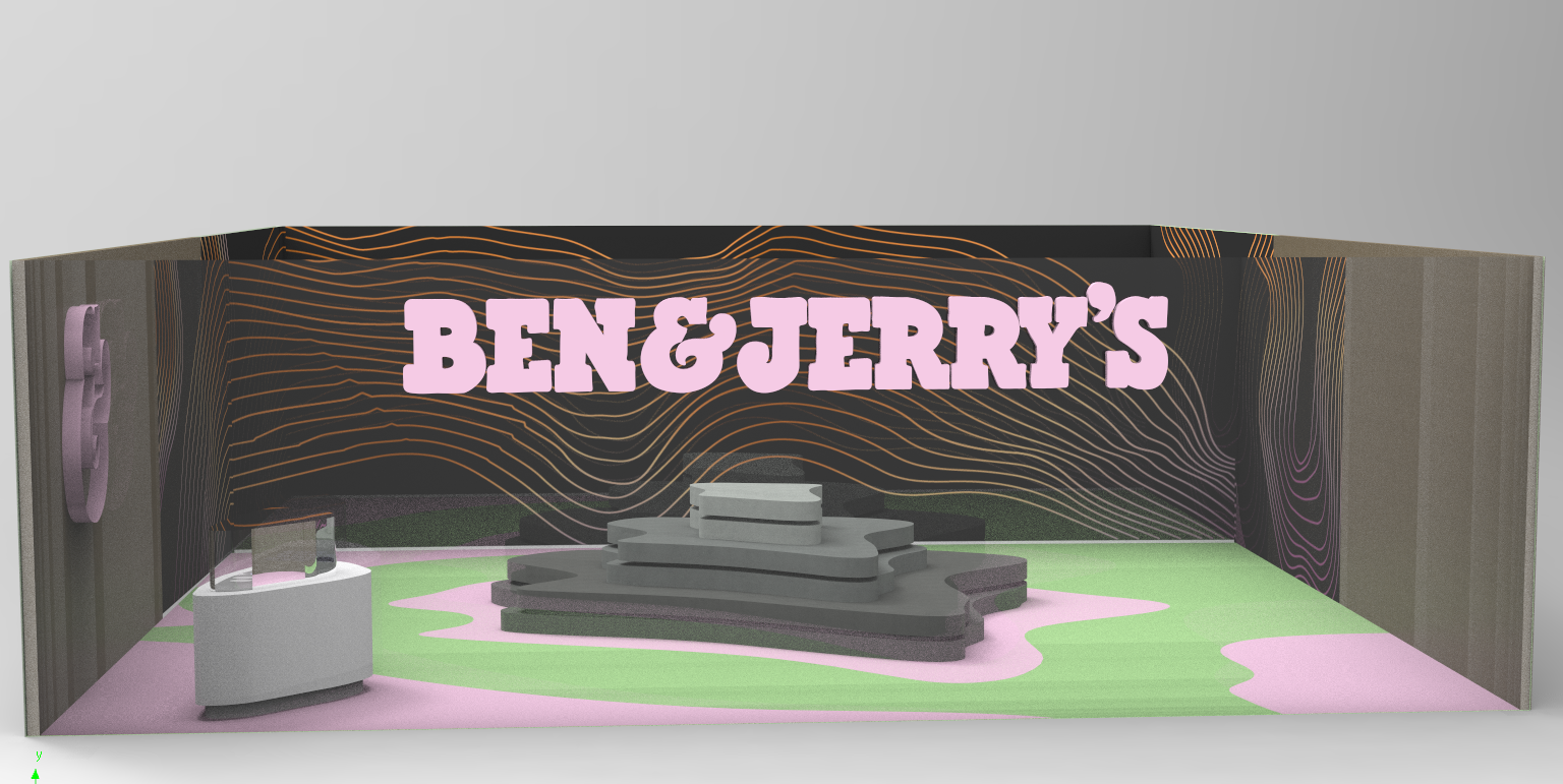
The color concept does not follow the brand's CI, but has been adapted for this purpose: Pink stands for the blossom of the almond tree, white for the almond milk. Grey and green represent the landscape where the almond grows.


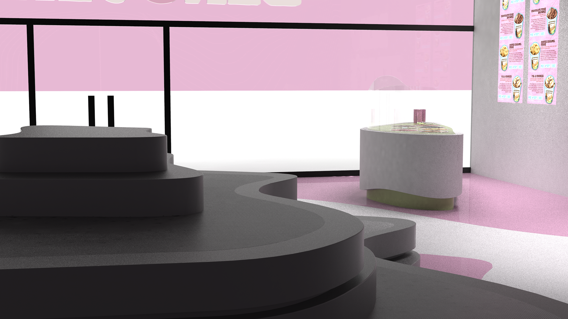

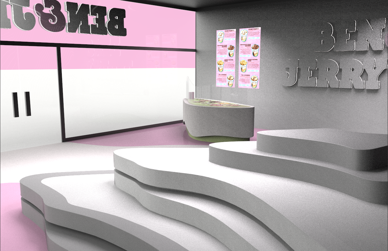
The leitmotif for the design is the contour line. Ben & Jerry's decorates a green hilly pasture where the cows graze. The almond also grows in similar proportions. For the European market, almonds could come from Mallorca, where there are many plantations of this kind. In the Serra de Tramuntana, for example, a mountain pass in the north-west of the island. If you look at a topographical map, you will immediately notice the contour lines. These are an abstraction to represent a landscape, which is why they are perfectly suited as a design element. The contour line is used to shape the large seating landscape in the middle of the room, but also in the design of the ice cream counter. As a key visual, the contour line is permanently projected onto the 270° screen in a changing color concept.
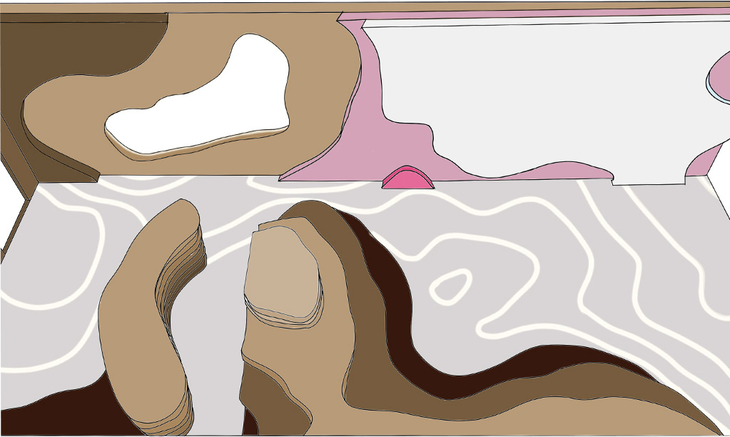


The first sketch is traversed by contour lines. After all, a reduction to the appropriate level is crucial. Different colour concepts must be tested. Wood optics is often used in Ben & Jerry's stores, but here replaced by concrete / mountain optics in favor of the concept.
